Visualization, Intro
Customer Analytics Week 1
This version: May 2026 | License: CC BY 4.0 | We use javascript to track readership.
We welcome reuse with attribution. Please share widely.

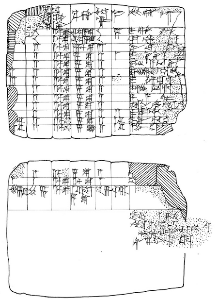
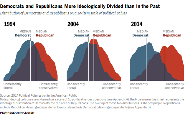
Data Viz are older than 0
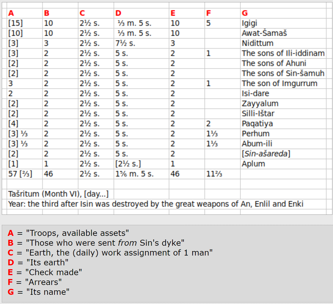
Translated

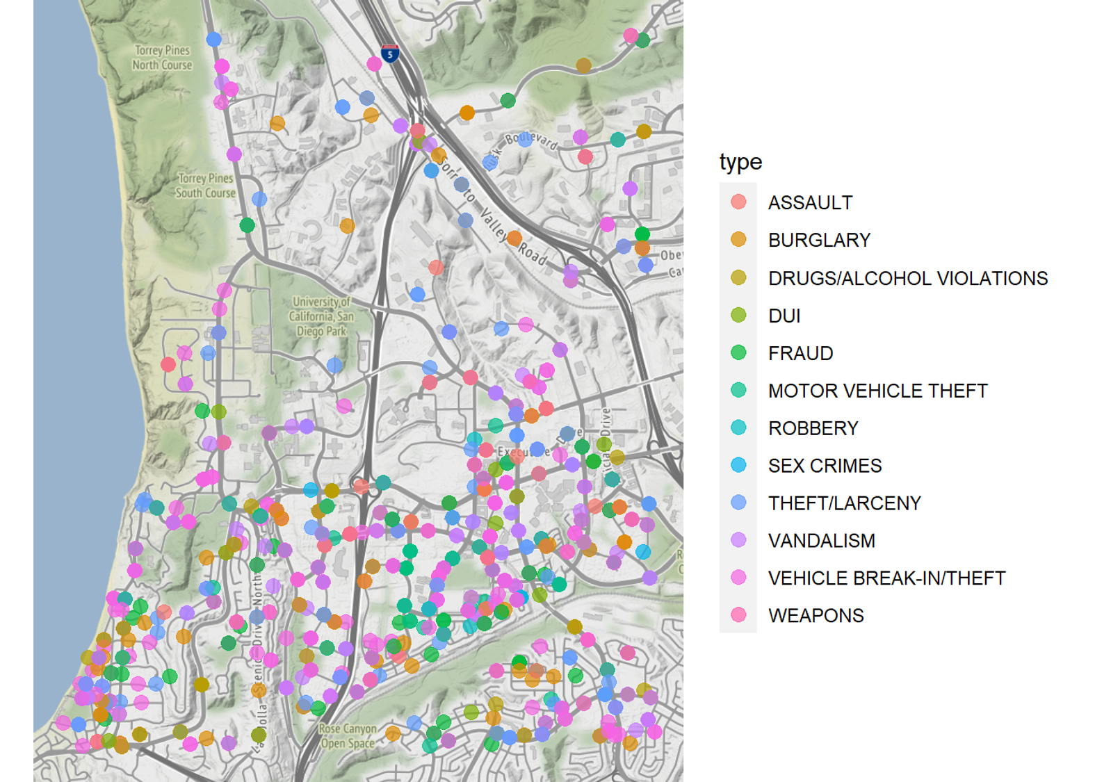
SDPD Crime Reports Near UCSD
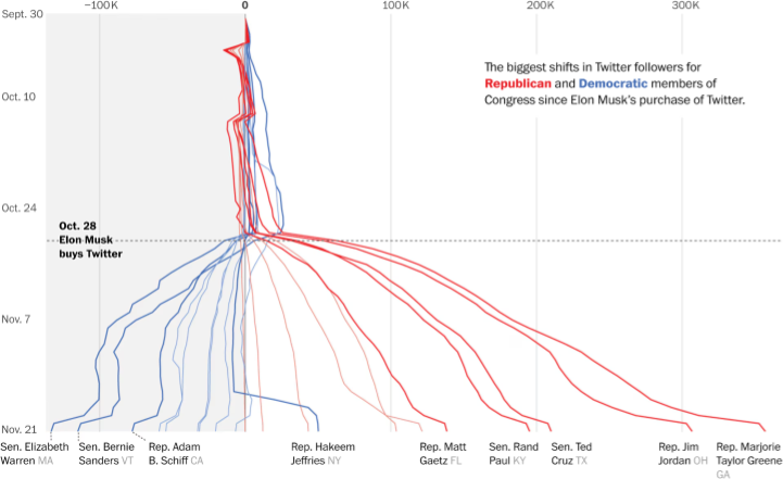
Honest Viz
- Usually start axes from 0, choose scales judiciously
- Show all relevant data, label accurately
- Discretize and smooth judiciously
- Show uncertainty when relevant
- Cite data sources
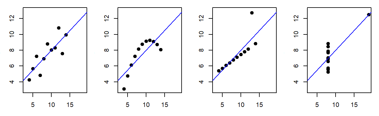
Visualize data before you model anything
- 4 Datasets, Same \(\hat{\beta}^{OLS}\), i.e. same \((x'x)^{-1}x'y\)
Customer
- Receives good or service in exchange for payment (money, time, attention)
- Has agency: Can say “no”
- “The purpose of business is to create and keep a customer.”
-Drucker - “There is only one boss. The customer. And he can fire everybody in the company from the chairman on down, simply by spending his money somewhere else.” -Walton
- “In the long term, there’s never any misalignment between customer interests and shareholder interests.” -Bezos

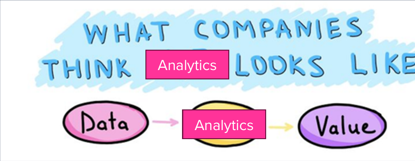
Analytics
- Using data to improve decisions
- Popularized by Charles Taylor in 1910s
- Further popularized by Moneyball (2011)
- From less to more sophisticated: Measurement, Heuristics, Graphics, Models, Predictions, Automation, Optimization, Personalization, …
- Can be deceptively difficult

Example: Nielsen
Consumer Panel Data include longitudinal data beginning in 2004. These data track a panel of 40,000–60,000 US households and their purchases of fast-moving consumer goods from a wide range of retail outlets across all US markets.
Retail Scanner Data consist of weekly pricing, volume, and in-store marketing info generated by point-of-sale systems from 90+ participating retail chains across all US markets. Data begin in 2006.
![]()
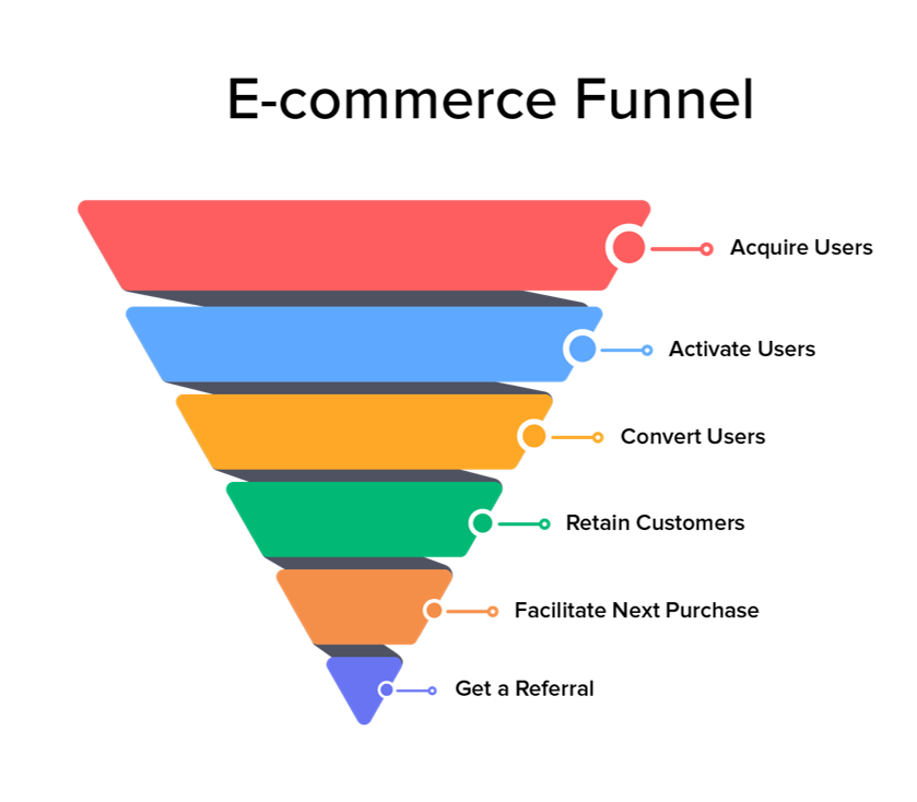
E-commerce Analytics
Why is analytics hard?
- Executives may be territorial, prefer hunches, or misunderstand what data can and cannot do
- Analysts are expensive, hard to find, and not always interested in the business context
- Culture determines whether analytics makes decisions or merely justifies them; low-trust environments punish messengers and underuse data
Legacy Terms
MGT 100 Principles
- Survey the field broadly, pointers for deeper learning. Why R?
- Piazza for all asynchronous interaction. No email or canvas messages
- Important for fairness, timeliness, contribution scores & instructional team collaboration
- “When it comes to LLMs, skillful prompting leaves amateurs in the dust.”

Coding & Script
- Conjecture:
(debugging difficulty) is exponential in (lines of code) - We can code fast or slow. “Go slow to go fast”
- Pipe: y <- f(g(x)) is the same as y <- x |> g |> f
- Old pipe was %>% ; remains widely used

Today’s script
- Data Import/export
- Data manipulation, summarization
- 5 verbs: Summarize, select, filter, arrange, mutate, group_by
- Univariate statistics
- Univariate plots
- Bivariate statistics
- Bivariate plots

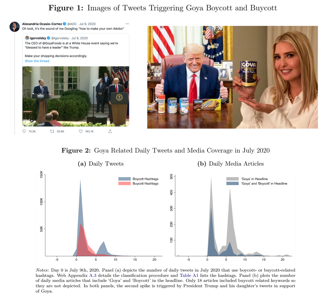
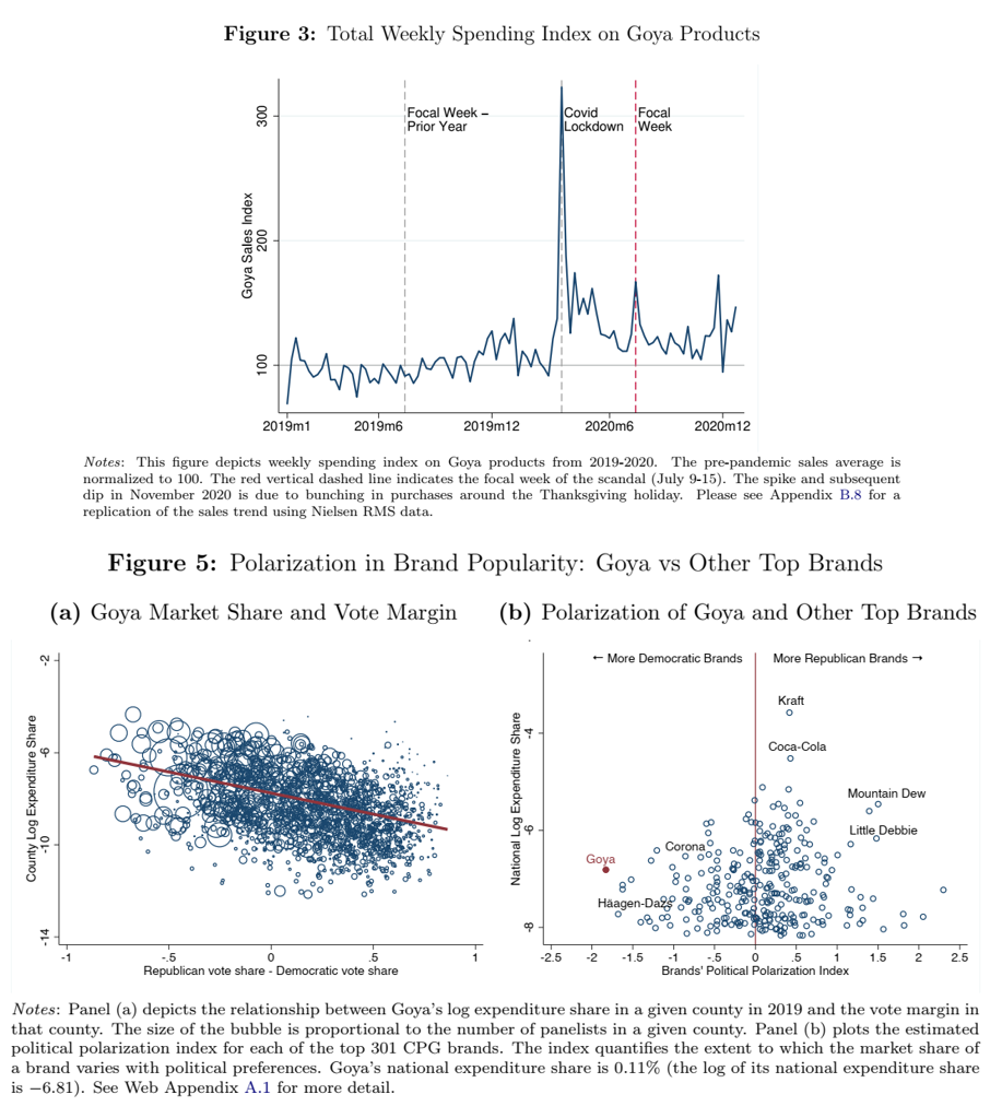
Week 1 Competition
| Week (relative to endorsement) | Region | Goya sales |
|---|---|---|
| -4 | Right-leaning | 87 |
| -3 | Right-leaning | 85 |
| -2 | Right-leaning | 87 |
| -1 | Right-leaning | 90 |
| 0 | Right-leaning | 140 |
| 1 | Right-leaning | 133 |
| 2 | Right-leaning | 110 |
| 3 | Right-leaning | 95 |
| -4 | Left-leaning | 158 |
| -3 | Left-leaning | 159 |
| -2 | Left-leaning | 158 |
| -1 | Left-leaning | 159 |
| 0 | Left-leaning | 176 |
| 1 | Left-leaning | 170 |
| 2 | Left-leaning | 162 |
| 3 | Left-leaning | 158 |

Recap
- Customer analytics :
Using customer data to improve decisions - Data Viz is the first step in customer analytics
- Marketing : Meeting customer needs profitably
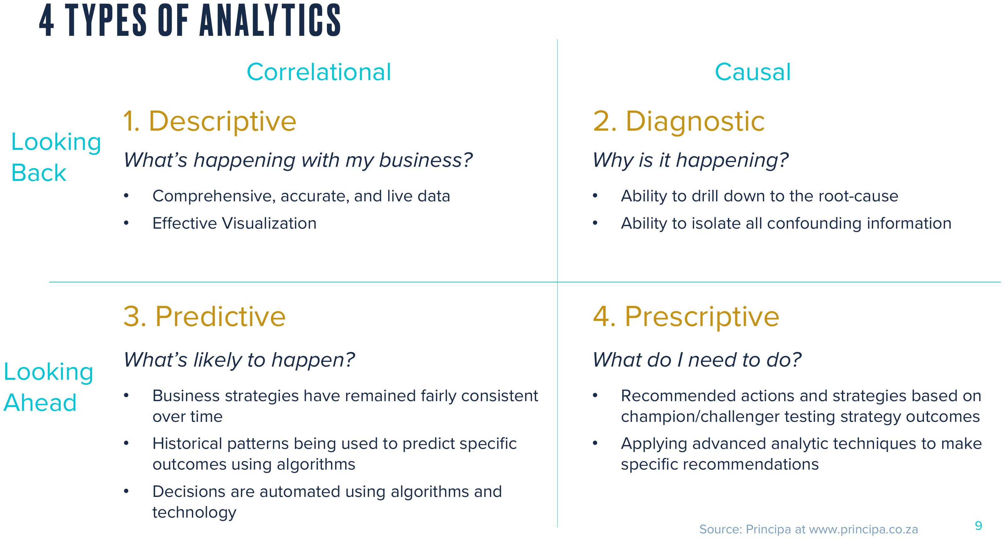
- Analytics types:
Descriptive, Diagnostic, Predictive, Prescriptive - Summarize, select, filter, arrange, mutate, group_by

Going further
- Data-enabled storytelling (Wilke 2019)
- GGplot2 YT video
- Elegant Graphics for Data Analysis (3e)
- Big Book of R: Lovingly curated, well organized, free resource directory for nearly any R problem
- A Layered Grammar of Graphics (Wickham 2007)